Design
Color Schemes for Your Watchfaces
By Brandon Him
May 11th, 2020
For many developers making their way into design, they find colors to be troublesome. It's easy to think, "slap some colors on it, should look good enough" as an effective motto, but it can off-put many potential users.

"Moar colors, moar better!"
Fortunately, you don't have to be a hipster flannel, wearing the latest Warby Parkers to come up with vivd color combinations to create a beautiful watchface.
Now it's important to note that I don't classify myself as a designer, but I'm extremely lucky to have worked as an intern web designer under the tutelage of amazing designers trained in highly-regarded institutions.
So here are my some of my personal tips and tricks that I use to create color schemes.
Tip 1: Strong Contrast On Important (Primary) Elements
This is pretty obvious, but strong contrast is what draws the user's eyes into something rather important. For watchfaces, this is suited for elements such as the time and the date.
Look what happens when we contrast for a rather contrived intention.
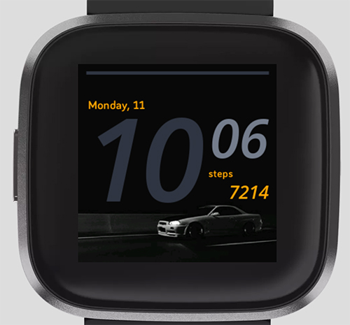
You'll probably notice that you immediately went for date and fitness stats, and then gradually went to the minutes, and lastly the hour.
Now here is a comparison of where we shift focus on the hour.
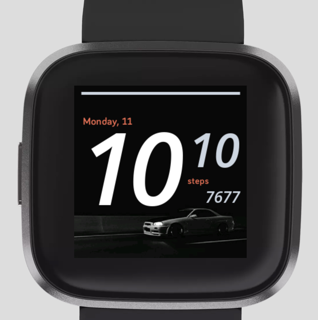
Spot the diference?
Tip 2: Use a Color Wheel
You may already know, but a color wheel is an effective tool to determine the pairing of colors. It's like the adjustable triangle for designers and translates to pretty much any area of design (interior, product, graphic, etc).

Reference: https://homemadelovely.com
I prefer to keep it simple and use three foundational color scheme models (plus, I don't remember all of them 😅)
Monochrome (one color)
Compliments (two colors)
Analogous (up to 6 colors)
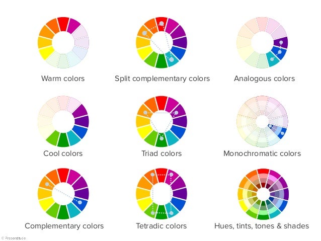
Reference: Slideshare.com
Tip 3: Use a Color Scheme Generator
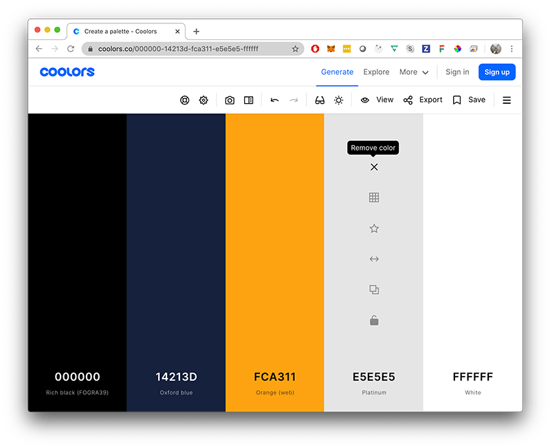
There are many great color scheme generators, and you should use them to your disposal. They are a quick way to come up with ideas, and combinations, just fine-tune them based on your perception and feel.
- Coolors.co - My personal favorite. See trending palettes, quickly generate with the space key, adjust colors, and more. Available on iOS, photoshop, or on their site.
- Colorhunt.co - A Reddit upvote layout where you can see highly voted color themes.
- mycolor.space - Really insightful as it also gives you matching gradients and a plethora set of color combinations based on a hex code.
Tip 4: Flat Colors for Primary Colors
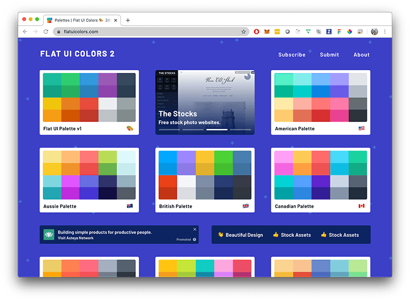
I'm a huge fan of flat colors for my primaries, they are bright and contrasting but feel pleasing to the eye. Honestly, flat UI is a bit of a dated trend (circa 2013), but the colors from that trend will always remain fun, and visually striking... you can almost say they are timeless.
I prefer to use Flat UI Colors to quickly find a flat color.
Conclusion
I hope you found this helpful and a step in the right direction for you. It's also important to note that sometimes (many times) users prefer their own creative choices that defy all of art theory, so consider giving the freedom to choose colors in your Fitbit watchface's settings.
I guess you can say, "beauty is in the eye of the beholder".
Feel free to discuss and talk to me on the unofficial Fitbit developer discord, just message @brando and say hi.
